 eyckgalleryartistsexhibitionsnewspublications
2016


P. Struycken and Carel Blotkamp, Dutch Concert, view andriesse eyck gallery, 2016
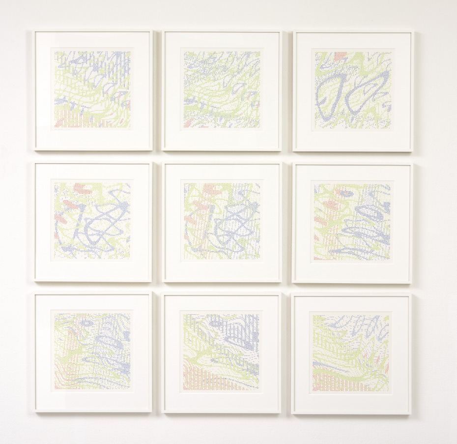
P. Struycken, Serie 4oct82, 1982
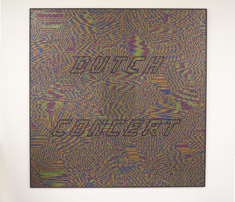
P. Struycken / Carel Blotkamp, Dutch Concert 2, 2014
P. Struycken, Articulation of Color 04 feb 16, acrylic on canvas, 2016
P. Struycken and Carel Blotkamp, Dutch Concert, view andriesse eyck gallery, 2016
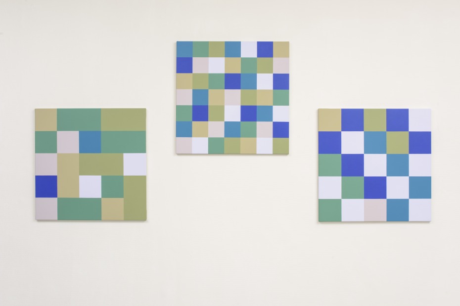
P. Struycken, Articulation of Color 20 jan 16, acrylic on canvas, 2016
P. Struycken / Carel Blotkamp, Dutch Wife, 2004
P. Struycken and Carel Blotkamp, Dutch Concert, view andriesse eyck gallery, 2016

P. Struycken and Carel Blotkamp, Dutch Concert, view andriesse eyck gallery, 2016
P. Struycken and Carel Blotkamp, Dutch Concert, view andriesse eyck gallery, 2016
3 Sep — 15 Oct 2016
DUTCH CONCERT, P. Struycken en Carel Blotkamp
3 September - 15 October 2016
opening 3 September 17.00 - 19.00
(dutch version)
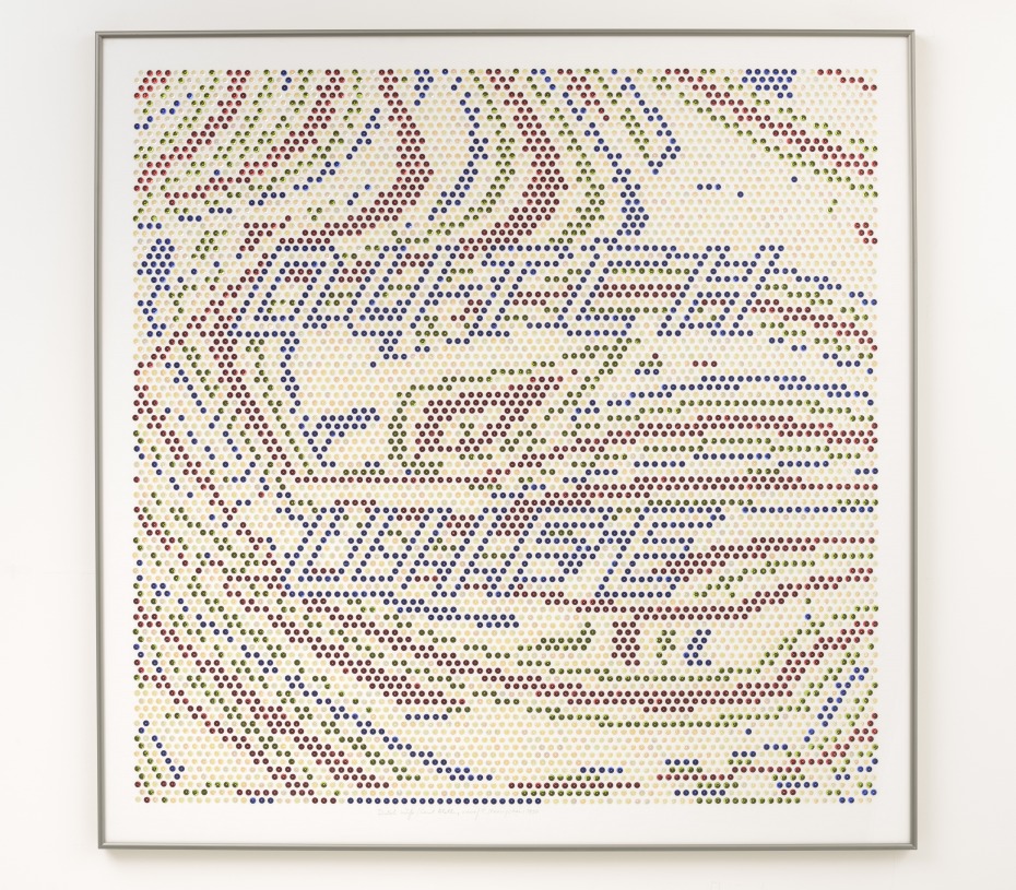
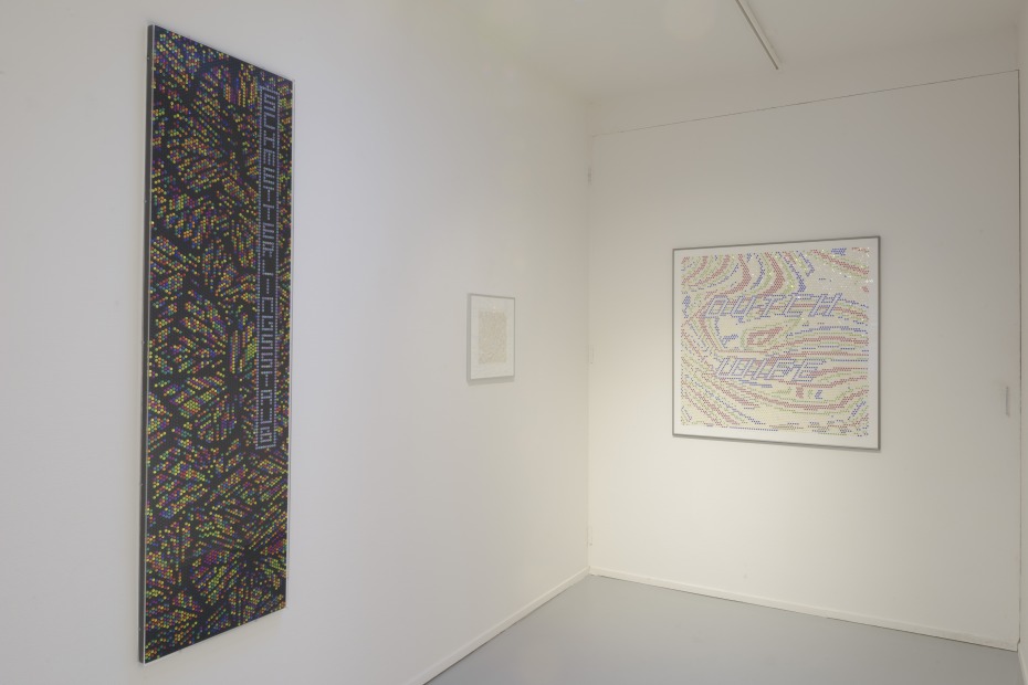
DUTCH CONCERT is a cacophonic duet by P. Struycken (1939) and Carel Blotkamp (1945). The ensemble is best known for their joint works, created in 2003/2004 and 2014. The compositions are based on Struycken’s computer drawings with coloured squares, which Blotkamp then translates into his typical visual language of sequins. English expressions featuring the word ‘Dutch’ can be detected in the shimmering of the material. The phrases, many of which are negative, refer to traits commonly ascribed to the Dutch people (‘Dutch generosity’ as an ironic nod to parsimony, or ‘Dutch defence’ for feeble defences). The artists’ interaction has given rise to the separate presentation of recent bodies of work by both artists.
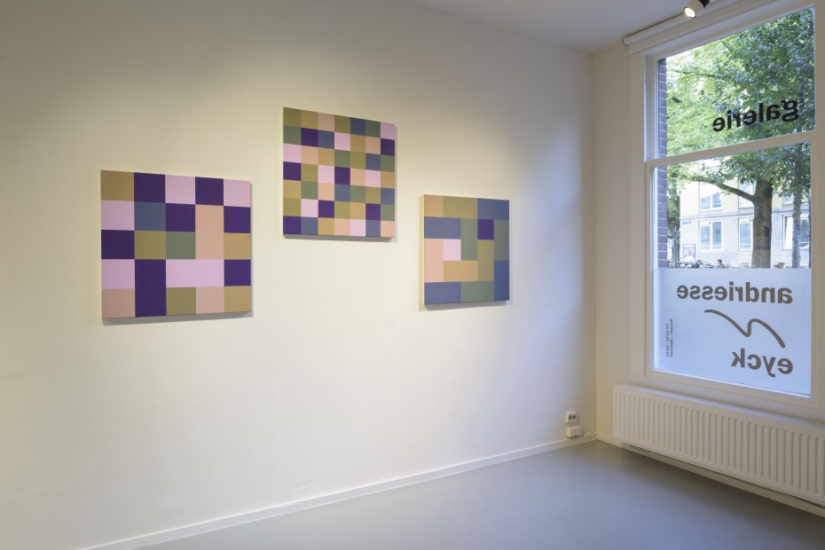
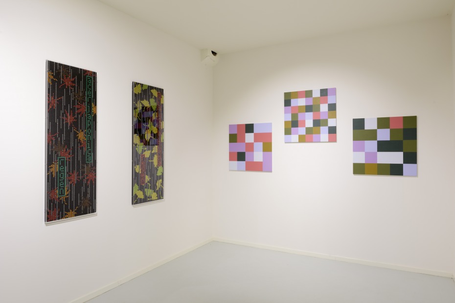
Struycken’s new paintings, (see text written by the artist) Articulation of Colour (2015-2016), are triptychs; each has its own palette of seven colours that are interrelated by a scrupulous visual coordination of colour tone, lightness and saturation. Every canvas consists of the same seven colours, painted in a subdivision of squares. In the centre panel, the colours are distributed equally, in equal numbers, and with the same regularity to create an equal balance between all the relationships and synergies. To achieve a different impression of the same colours, Struycken gave the two side panels an unequal coverage, more pronounced than that found in his Colour Relationship series of 2014. And yet, by virtue of the relationships between the colours, the palette is no less recognisable. In the pair of side panels, the variable coverage that Struycken employs to accentuate particular colours, amplifies the qualities of the palette that evoke the viewer’s preference, association and mood in a different manner.
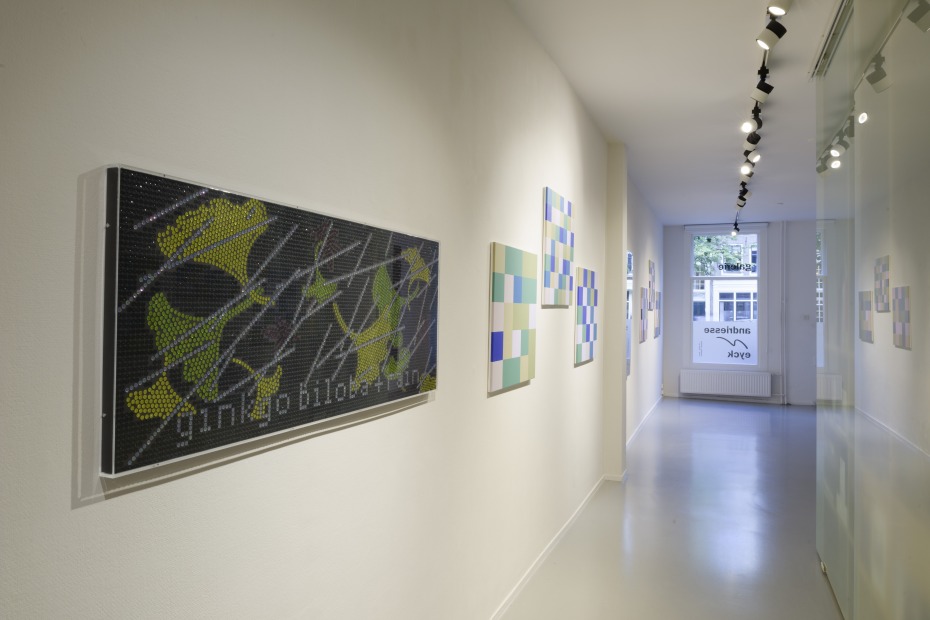
The sparkling compositions of Blotkamp, which integrate thousands of sequins, glimmer at the viewer. In the artist’s most recent work, text is a central element, although it dissolves amid the sparkle and opulence of the material. Inspired by nineteenth-century Japanese wood block stencils used to print kimonos, the works contain both visual and textual references to natural elements such as weeping willows, walnut trees, or rain. In some instances, the examples are meticulously copied, while in others they are freely interpreted and produced using grids. The customary and irrefutable unity of idea, image and materiality is, to a great extent, disrupted by the execution in sequins, which generates confusion concerning both the nature, and meaning, of the image.
This unorthodox dialogue is accompanied by older work: a series of drawings and diptychs from Struycken’s Colour Relationship series of 2014, and a number of small-scale sequin works by Blotkamp, based on art postcards.
Follow us: 
