 eyckgalleryartistsexhibitionsnewspublications
 eyck
eyck2014
6 Sep — 18 Oct 2014
opening: Sat. 6 September 5-7 pm
RGB exit
Colour Relationships (dutch version)
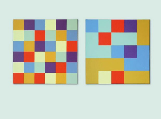
I have executed this series of works entitled ‘Kleurverhouding’, or ‘Colour Relationships’, by hand for the first time in over fifty years. Each work consists of two 60 x 60 cm canvases painted with acrylic paint which in some cases is applied in up to ten layers to create an entirely uniform surface. On one canvas, the six colours are divided over a grid of 36 squares. This division derives from following clear rules that aim to distribute the colours equally, and preclude the formation of shapes that arises when two same-colour squares are positioned side by side. Each colour occurs with equal frequency and adjoins each of the other five colours with equal frequency.
On the other canvas, the same six hues are distributed over a grid of 25 squares, this time in unequal numbers, and positioned at random. Squares of the same colour may be placed edge to edge to allow the creation of different shapes such as angled forms and elongated rectangles. Figuration accentuates individual colours, yet that appears to have no effect on the visual impression of the reciprocal relationships: both paintings provide the same colour impression. Clearly, the composition as a whole depends more on the relationships between colours than the individual hues, despite their differing quantities and figurative effects.
Colours and relationships
The six hues that are used – yellow, yellow green, blue green, blue, violet and red – are spaced at equal distances on a colour wheel. As a result, the difference between yellow and yellow green is visually akin to the difference between blue and violet or between red and yellow. An equal division of the colour wheel yields the greatest possible difference in colour tone.
Cohesion between the colours is created by a careful balance of their three qualities: the aforementioned colour tone, the aspect that hence determines the naming of a colour, the clarity and the saturation.
The harmonisation of light/dark and of strong/weak has a greater impact on the result than the choice of colour tones. To demonstrate this, the colour tones in each work in the series are the same; in each pair of paintings, only the clarity and saturation differ.
I chose simple relationships for those differences, based upon which the colours were mixed by eye.
The placement of the colours
The six hues on the canvases with a grid of 36 squares were organized according to a computer programme written by the engineer D. Dekkers. 36 is the lowest number that allows all six colours to occur individually and in equal number, and appear beside each other with equal frequency. I specifically wanted to distribute the colours equally over the squares, so that each appears with the same regularity, is placed next to the other five colours with the same regularity, and squares of the same hue are never side by side nor touching a corner of the same colour. This produced a vast number of different alternatives, but also generated figurations resulting from repetitions, symmetries, rotations and ‘knight’s moves’ that disrupted a visually uniform distribution. Filtering out these figurations resulted in only one usable option. And this was consistently applied in the first canvas of each duo in the series.
The number of 25 squares for the other canvas ensures a highly diverse colour placement. In each canvas, the colours that are distributed over 1, 2, 3, 5, 6, 8 (= 25) squares, and their position on the grid, is determined at random. Shapes are created when squares of the same hue are placed side by side. There are billions of possible results, and all are appropriate. Figuration has the effect of lending colours a decorative aspect, of intensifying their effect yet has little fundamental impact on their relationships which is what defines the visual impression of the whole.
The two canvases need not be hung next to each other; they can also be installed in separate spaces. This heightens the experience of the difference, and simultaneously the recognition of the identical colour relationships all the more.
ps 2014
Follow us: 
